Introduction
Challenge: Users often face difficulties in understanding how to activate the feature, leading to a lack of familiarity and trust.
-
Familiarity with SOS Feature
-
Accidental Triggers
-
Trust in Emergency Systems
-
Unified Gestures
-
Effective cancellation system
By making the emergency SOS feature more intuitive, we enhanced the system experience to reduce accidental triggers while increasing familiarity and trust in the system. Key improvements, like confirmation processes and prompt messaging, boosted the overall effectiveness and reliability of the emergency response.
Anecdote By Neha (18 yr student)
"For my safety during travel, I would trust the emergency SOS feature of third party app (ola, Uber) rather that android emergency SOS system due lack of trust and unfamiliarity"
The heart of the project
Anecdote By Revati (80yr old living alone)
"I was scared that the police would arrive at my doorstep at 2 am after the accidental pop-up.

My Impact
-
Improved user interaction with the SOS system through streamlined, intuitive design.
-
Reduced accidental triggers by refining gestures and minimizing unnecessary pop-ups.
-
It increased user trust and confidence in emergency systems with clear instructions and reliable features.
-
Empowered individuals to act confidently in emergencies, reducing response time.
-
Provided peace of mind by ensuring the SOS system is easy to access and use, especially in high-stress situations.
-
Enhanced safety by delivering timely emergency notifications and accurate location sharing.
The Primary Goal is to ensure that users can quickly and seamlessly access emergency services while prioritizing the security of their personal information.
Pain Points & Synthesised Statement
-
Users find the current system unreliable due to accidental pop-ups, inconsistent gestures, and a lack of awareness about how to use the system. Additionally, some users experience no response when dialing emergency numbers, and system features like buzzers or medical info are difficult to access during emergencies.
-
The synthesized statement suggests the need for a unified accessibility system with high efficiency and a strong response rate. The solution should focus on building user trust in the emergency SOS system, ensuring easy but reliable access while avoiding accidental pop-ups.
Understanding the users
-
Age and technology gap: This generational difference affects their interaction with and trust in emergency alert systems.
-
Shared frustration with accidental alerts: This common pain point suggests a need for improving the user interface and activation mechanisms of emergency features across different age groups.
-
Trust issues in emergencies: This highlights a need for building user confidence in these critical safety features.
-
The desire for personalized emergency contacts: suggests a potential improvement in emergency systems by allowing users to customize their emergency contact lists.
Defining the features
-
Converting challenges into "How Might We" (HMW) questions, such as how to build trust in emergency systems, create familiarity with SOS features, and reduce accidental pop-ups.
-
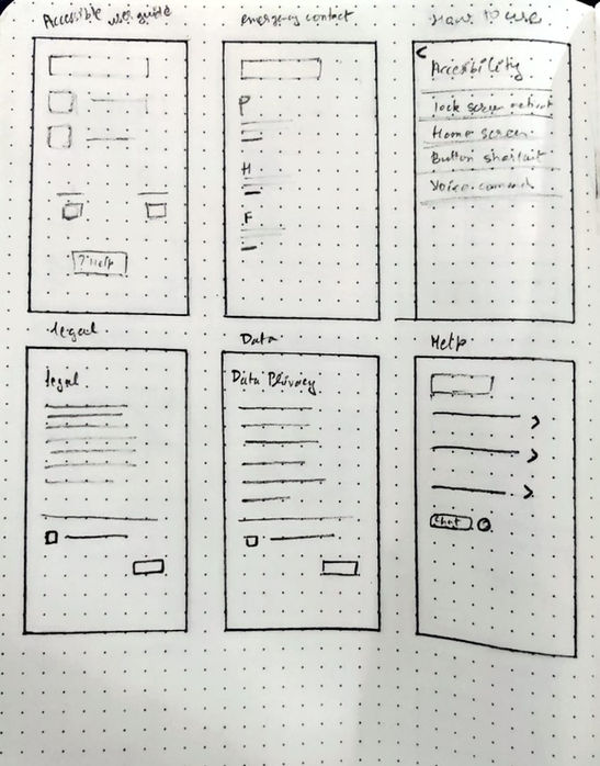
The Minimum Viable Product (MVP) outlines essential features for the updated SOS system, including a reliable SOS function, emergency messaging, auto-calls, confirmation and cancellation options, location sharing, and legal compliance features.
-
The goal is to enhance user experience during emergencies with a unified and efficient system.
Understanding the Impact
& Influence
-
Phone makers and Android developers are key decision-makers with high impact and influence.
-
Emergency departments are crucial end-users but have limited influence on system design.
-
Android users and persons in danger have significant influence but less direct impact on system changes.
-
There's a need to balance technical capabilities (driven by high-impact stakeholders) with user needs (represented by high-influence stakeholders).

Possitive User Journey

Competitor Analysis


Navigation Flow
Site Map
UI Exploration for Seamless and Trustworthy SOS Systems
_edited.jpg)
Heuristics Evaluation
_edited.jpg)
Heuristics Evaluation
Key Takeaways
Efficiency and Cognitive Load
The design should minimize memory load and increase actions per frame. This suggests a need for a more intuitive, streamlined interface
Error Handling
The interface lacks clear error prevention and recovery mechanisms. Users need guidance on how to correct mistakes or go back if an error occurs.
Consistency and Navigation
There's a need for consistent layout and improved primary navigation. The absence of clear navigation elements could confuse users, especially in emergency situations.
Component Library & Design System


Task Flows


Learnings
-
User-centered design is Key: Understanding real-world challenges and user behaviors is critical in creating solutions that are practical, reliable, and easy to use in emergencies.
-
Simplification Improves Usability: Streamlining the SOS feature with unified gestures and minimizing accidental pop-ups enhances user experience and reduces frustration.
-
Trust is Built Through Clarity: Clear communication and intuitive designs play a crucial role in establishing user trust, particularly in life-critical systems like emergency services.
-
Cross-Platform Consistency: Ensuring functionality across both Android and iOS systems allows for wider accessibility and consistency in delivering emergency services.


